Unlocking the Power of Bitcoin Liquidation Maps: Avoid Costly Crypto Liquidations
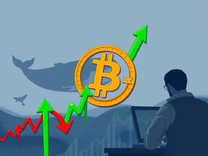
Navigating the volatile world of cryptocurrency requires sharp tools and keen insight. For many traders, understanding potential market movements is key to survival, especially when using leverage. This is where a Bitcoin liquidation map becomes an indispensable asset. It’s often described as a ‘secret map’ used by large market players, or ‘whales’, to identify price levels where many leveraged positions are vulnerable. By learning how to read this map, you can anticipate these critical zones, protect your capital, and potentially improve your crypto trading strategy.
What is Crypto Liquidation and Why Does it Matter?
Before diving into the map itself, it’s crucial to understand crypto liquidation. In simple terms, liquidation occurs when an exchange automatically closes a trader’s leveraged position because they no longer have enough margin to cover potential losses. This happens when the market moves significantly against their bet.
- Long Liquidations: Occur when the price falls, hitting traders who bought with leverage expecting prices to rise.
- Short Liquidations: Happen when the price rises unexpectedly, impacting traders who sold with leverage expecting prices to fall.
A single large market swing can trigger a cascade of liquidations, especially in a highly leveraged market like crypto. These cascades can accelerate price movements, creating opportunities for some while causing significant losses for others. Avoiding forced liquidation is a primary goal for anyone engaging in leveraged trading.
Understanding the Bitcoin Liquidation Map
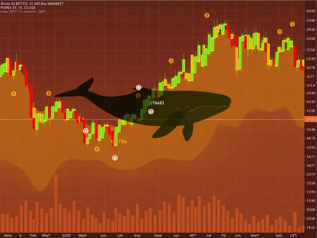
A Bitcoin liquidation map is a visual representation, often a heatmap, showing price levels where a significant amount of leveraged positions are likely to be liquidated. These maps aggregate data from exchanges to highlight areas of high ‘liquidity’ – not in the traditional sense of trading volume, but as clusters of stop-loss orders and liquidation points for leveraged positions.
Tools like CoinGlass provide real-time liquidation maps for Bitcoin and other cryptocurrencies. By observing these maps, traders can:
- Identify potential price targets for large market movers.
- Anticipate areas where price movements might accelerate due to cascading liquidations.
- Set more effective stop-loss orders to protect their own positions.
- Gain insight into where significant market interest (via leveraged positions) is concentrated.
How Does a Liquidation Map Work? Key Components Explained
Liquidation maps are typically displayed as charts with price on one axis and the potential liquidation volume or strength on the other. Here are the main components:
- Price Axis (often X-axis): Represents the Bitcoin price levels.
- Liquidation Strength Axis (often Y-axis): Shows the relative amount of leveraged positions that would be liquidated at a given price level. Taller bars or brighter colors indicate a higher concentration of potential liquidations.
- Heat Zones / Liquidity Clusters: These are the prominent areas on the map, visually highlighted, where large numbers of liquidations are expected if the price reaches those levels. These zones act as magnets for price.
- Open Interest: While not always a direct visual component of the heatmap itself, the underlying data reflects where significant open leveraged positions are concentrated.
The map essentially shows how the market is positioned in terms of leveraged bets. When the price moves towards a dense heat zone, the probability of triggering those liquidations increases, potentially causing further price movement in that direction as positions are closed.
Using the Map to Track Whale Moves Crypto
Why are these maps sometimes called ‘secret maps’ used by whales? Large traders and institutions, often referred to as ‘whales’, have the capital to influence market prices. They can observe these liquidation maps just like retail traders. Knowing where large clusters of vulnerable positions exist provides whales with potential price targets. By pushing the price towards these zones, they can trigger liquidations, profiting from the resulting price volatility and potentially filling their own orders at favorable prices.
Tracking potential whale moves crypto involves looking for areas on the map with extremely high liquidation density. These are the zones most likely to attract price action. By understanding that whales might target these areas, you can adjust your own crypto trading strategy accordingly.
Incorporating the Bitcoin Liquidation Map into Your Trading Strategy
A Bitcoin liquidation map is a powerful tool when used correctly. Here’s how to integrate it into your trading:
- Identify High-Risk Zones: Pinpoint dense liquidation clusters. Avoid placing highly leveraged positions too close to these zones, as they are prone to price swings.
- Set Stop-Loss Orders: Use the map to determine logical places for your stop losses. Placing stops just beyond a significant liquidation cluster can provide a buffer against price hunting, but be aware that these zones are targets. Placing stops within a cluster makes them vulnerable.
- Time Entries and Exits: Observe how price reacts as it approaches liquidation zones. These areas can sometimes act as reversal points after liquidations occur, or as acceleration points if they break through.
- Combine with Other Tools: Liquidation data is most effective when used alongside traditional technical analysis (support/resistance, trendlines, indicators) and fundamental analysis (news, market sentiment).
- Anticipate Volatility: Areas with high liquidation density signal potential future volatility. Be prepared for rapid price changes around these levels.
Common Pitfalls When Using Liquidation Maps
While insightful, relying solely on a Bitcoin liquidation map can be misleading. Avoid these common mistakes:
- Trading Blindly Towards Clusters: Don’t assume price will automatically hit every liquidation zone. Markets are complex and influenced by many factors.
- Ignoring Context: The map shows potential, not certainty. Macroeconomic news, regulatory changes, or sudden shifts in sentiment can override technical signals.
- Misinterpreting Scale or Color: Ensure you understand how the specific map tool represents density and volume.
- Overleveraging Near Clusters: These zones are magnets for price action, making positions placed nearby extremely risky.
Smart trading involves using the liquidation map as one piece of a larger puzzle, helping you understand market structure and potential manipulation, especially related to leveraged trading.
Conclusion: Mastering the Map for Smarter Trading
The Bitcoin liquidation map offers valuable insights into the potential mechanics driving short-term price movements in the leveraged crypto market. By visualizing areas where forced closures are likely, traders can gain a better understanding of market structure, anticipate potential volatility caused by whale moves crypto, and refine their own risk management strategies. Learning to read this map is not about predicting the future with certainty, but about understanding the landscape of leveraged positions and using that knowledge to navigate the market more safely and effectively. Incorporating this tool into your analysis can help you avoid becoming another data point on the map of crypto liquidation.
This article provides information for educational purposes and does not constitute financial advice. Trading cryptocurrencies involves risk. Always conduct your own research.