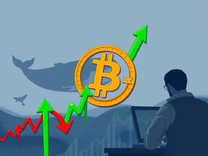
Mastering the Bitcoin Liquidation Map: Trade Safely and Avoid Crypto Liquidation
Navigating the unpredictable waters of the cryptocurrency market requires powerful tools. One such tool that can offer a significant edge is the Bitcoin liquidation map. For anyone involved in leverage trading, understanding this visual aid isn’t just helpful – it’s crucial for survival. It provides a unique perspective on potential price movements and areas of high risk. Let’s dive into how you can read and use this map effectively to enhance your trading strategy without falling victim to sudden market swings.
What Exactly is Crypto Liquidation?
Before we decode the map, let’s clarify the core concept. In crypto trading, crypto liquidation occurs when an exchange forcibly closes a trader’s leveraged position. This happens because the trader no longer has enough margin (collateral) to cover potential losses as the market moves against their bet. Think of it as an automatic stop-loss enforced by the exchange when your position becomes too risky for them.
- Long Liquidations: Happen when the price of an asset falls. Traders who bought expecting prices to rise (going ‘long’) are liquidated if the price drops too much.
- Short Liquidations: Occur when the price rises unexpectedly. Traders who sold expecting prices to fall (going ‘short’) are liquidated if the price increases significantly.
Did you know? Large-scale liquidations can create a domino effect. One forced closure can push the price further, triggering more liquidations, leading to rapid, significant price drops or spikes. This is often referred to as a ‘liquidation cascade’.
Understanding the Bitcoin Liquidation Map
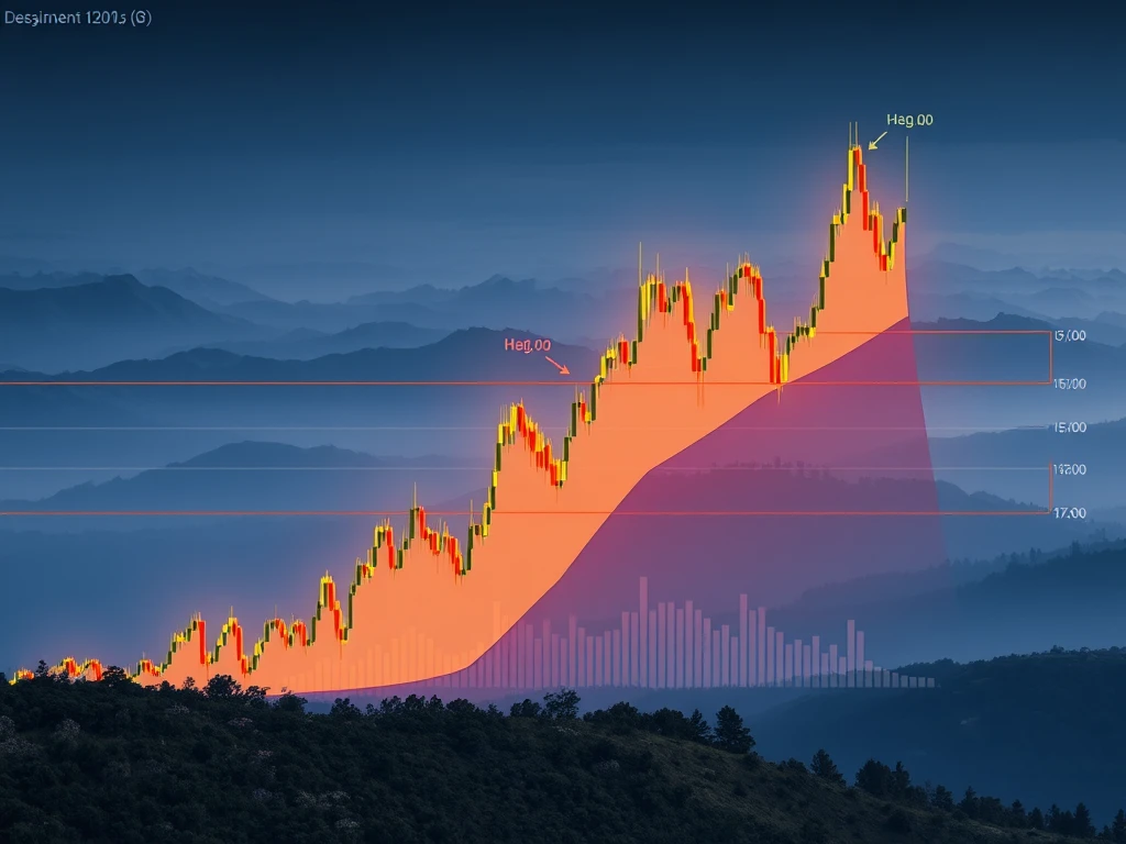
A Bitcoin liquidation map is a visual representation – often a heatmap – that shows price levels where large amounts of leveraged positions are concentrated and likely to be liquidated if the price reaches those levels. These maps highlight ‘liquidation clusters’ or ‘liquidity pools’ where significant forced selling (for long liquidations) or buying (for short liquidations) could occur, potentially acting as price magnets or reversal points.
Tools like CoinGlass offer real-time BTC liquidation maps, providing valuable insights. By using these maps, traders aim to:
- Identify potential price targets based on where large liquidity pools exist.
- Improve risk management by understanding areas of high liquidation risk.
- Spot potential entry or exit points based on expected price reactions near liquidation zones.
How the Map Works and Its Key Components
Typically, a liquidation map displays price on one axis and the estimated value or intensity of potential liquidations at each price level on the other. Taller bars or brighter colors usually indicate a higher concentration of leveraged positions ready to be liquidated at that price point.
Key elements you’ll find:
- Heat Zones/Liquidation Clusters: Areas on the map showing where the largest volume of liquidations is expected. These are critical price levels to watch.
- Liquidity Pools: Essentially the same as clusters, representing accumulations of stop-loss and liquidation orders. Breaking through these can cause swift price moves.
- Open Interest Levels: While not always directly on the map, understanding open interest (the total number of outstanding derivative contracts) at different price levels complements the map by showing where leveraged bets are concentrated.
- Price Imbalances: Gaps or areas with little trading history or support/resistance on standard charts can be areas where prices move quickly towards liquidation zones.
Did you know? Whales (large traders) are often aware of these liquidation maps. They can strategically place trades to push the price towards significant liquidation clusters, profiting from the resulting cascade and increased volatility.
Integrating the Bitcoin Liquidation Map into Your Trading Strategy
Using a Bitcoin liquidation map effectively means combining its insights with other analysis methods. Here’s how you can incorporate it into your approach:
- Identify High-Risk Zones: Use dense liquidation clusters to understand where significant price volatility is likely. Avoid overleveraging in these areas. These zones often act like magnets for price.
- Refine Entry and Exit Points: Liquidation clusters can help time trades. Entering or exiting positions just before a major cluster is hit might help secure profits or avoid being caught in a cascade.
- Combine with Technical Analysis: Enhance insights by overlaying liquidation map data with standard technical indicators like support/resistance levels, moving averages, or RSI. This provides a more comprehensive market view.
- Be Wary of the Herd: High concentrations of leverage can indicate crowded trades. These areas might be targeted by larger players. Don’t blindly follow the crowd into highly leveraged zones.
- Monitor Whale Activity: Watch for signs of large orders pushing the price towards significant liquidation levels. This can signal potential short-term price direction.
- Anticipate Reversals: Markets often see price reversals after large liquidation events exhaust one side of the market. Recognizing these patterns can help position for potential bounces or pullbacks.
- Implement Robust Risk Management: Liquidation maps are excellent tools for setting stop-loss orders. Place stop-losses strategically outside major liquidation clusters to minimize the chance of being swept up in a cascade. Manage your leverage carefully.
Using the Bitcoin liquidation map effectively requires discipline and integration with a solid overall trading strategy.
Common Mistakes to Avoid When Using Liquidation Maps
While valuable, misusing a Bitcoin liquidation map can lead to losses. Avoid these common pitfalls:
- Blindly Trading Towards Liquidity: Don’t assume the price will always reach the largest liquidation cluster. Markets are complex and can reverse before hitting these zones.
- Misinterpreting the Data: Ensure you understand what the colors, bar heights, and axes represent on the specific map tool you are using. Misreading the scale can lead to incorrect assumptions about risk.
- Over-Reliance: Liquidation data is a tool, not a crystal ball. It shows potential levels but doesn’t guarantee price action.
- Ignoring Macro Factors: Significant news events, regulatory changes, or shifts in overall market sentiment can easily override the technical signals shown on a liquidation map. Always consider the broader context.
Smart trading requires context and combining multiple analytical tools, not just relying on one colorful chart. Use the liquidation map as part of your comprehensive approach to risk management and leverage trading.
Conclusion
The Bitcoin liquidation map is a powerful visual tool that provides unique insights into market structure and potential price movements driven by leveraged positions. By understanding what crypto liquidation is, how the map works, and how to integrate it into your trading strategy alongside robust risk management, you can navigate volatile markets more effectively and increase your chances of success in leverage trading. Use it wisely, combine it with other forms of analysis, and remember that no tool guarantees profits, but informed decisions significantly improve your odds.